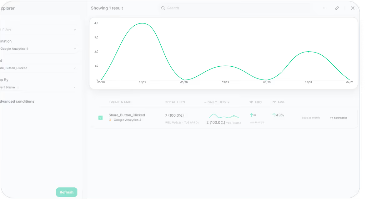
At Trackingplan, we’re continuously working to improve how you interact with your data. We're excited to introduce the interactive graph feature in Trackingplan's Data Explorer, designed to enhance your ability to explore and visualize your data trends effortlessly.
What’s New?
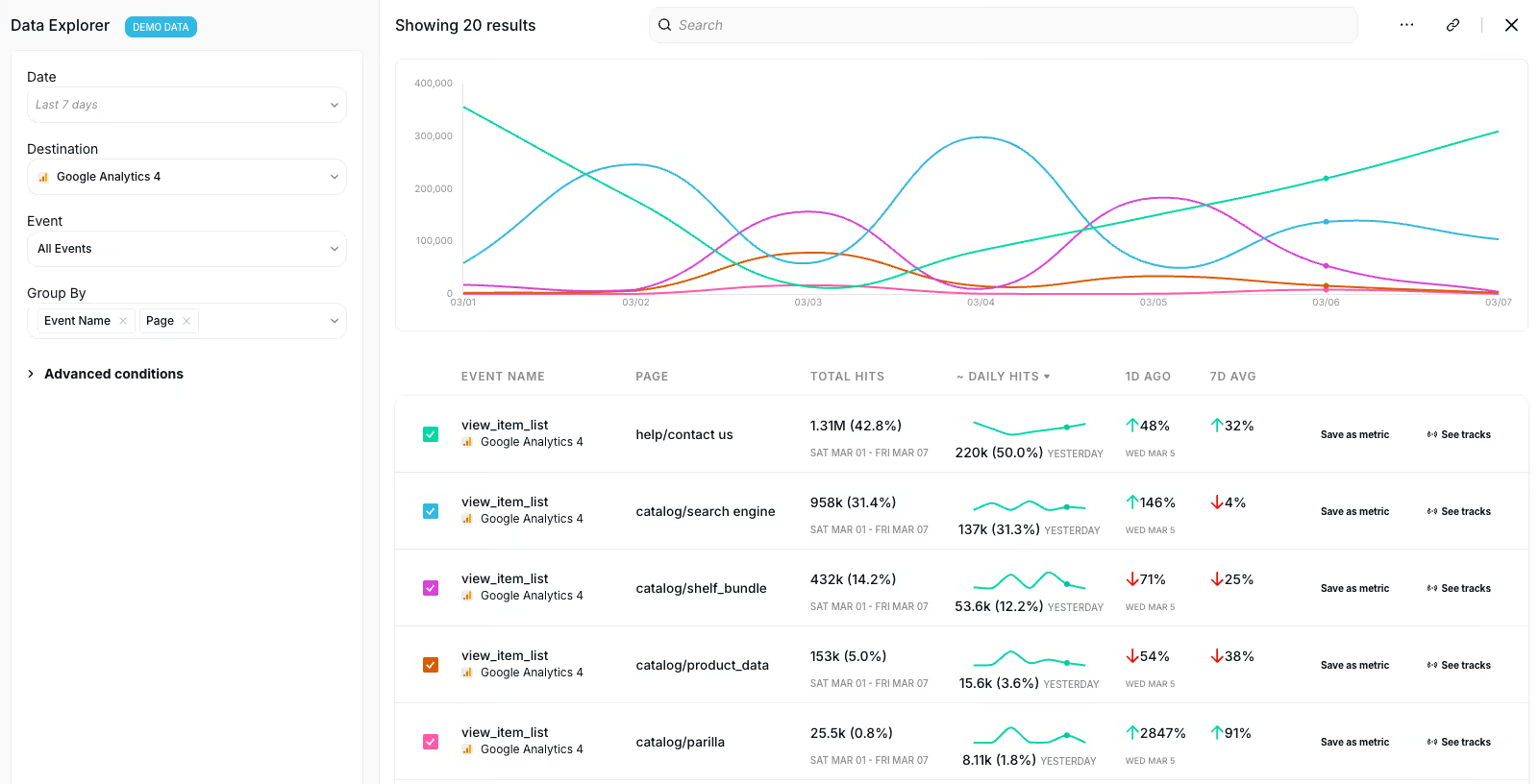
With this new feature, you can now view an interactive graph that makes it easier to compare hits data across different events. This means a clearer understanding of how your data evolves over time, empowering you to identify traffic trends and anomalies at a glance.
- Interactive Visualization: The graph updates in real-time as you personalize your Data Explorer view, helping you visualize event data with ease.
- Customizable Selection: By default, the first five rows are selected and displayed in the chart. However, you can fine-tune the selection to match your specific needs.
- Focus Mode: If no rows are selected, the chart remains hidden, providing a flexible and focused exploration environment to dive into your data without distractions.
This update offers greater flexibility, improved clarity, and a more powerful way to monitor your data for more informed decision-making.
Why This Matters
- Increased Efficiency: The ability to customize and focus on specific data points means you spend less time sifting through irrelevant data, leading to faster insights.
- Better Data Exploration: The new graph gives you a comprehensive view of how data trends evolve over time, helping you quickly spot potential issues or opportunities.
- Improved Decision Making: With clearer data visualization, you can make more accurate, data-driven decisions that align with your business goals.
How to Get Started
- Head over to the Data Explorer in Trackingplan.
- Select your desired events, and watch as the graph dynamically updates.
- Use the search bar to find specific events and customize your view.
For a detailed walkthrough, check out our tutorial video below:
We hope this update makes your experience with Trackingplan even more streamlined and insightful.
Need help getting started? Check out our documentation or reach out to our support team. Happy Tracking!