Unlock powerful insights with our guide to customer journey analytics. Learn to map user behavior, fix data issues, and drive real business growth.
Customer journey analytics gives you the complete story of how people interact with your brand. Instead of just seeing the final conversion, it connects every scattered touchpoint—from an initial social media ad view to a final purchase on a mobile app—into a single, coherent narrative. This holistic view is no longer optional for businesses aiming to thrive.
What Is Customer Journey Analytics Really

Imagine trying to understand a complex story by only reading the last page. You'd know the ending, sure, but you'd miss all the crucial plot twists, character development, and motivations that led there. For years, this is exactly how many businesses have analyzed customer behavior, focusing almost entirely on final conversion events like a purchase or a sign-up.
This old-school approach leaves massive blind spots. Customer journey analytics flips the script. It's the practice of tracking and connecting every single interaction a person has with your company across all channels and over time. Think of it like having a GPS that follows their entire path, not just their final destination.
Why a Complete Journey View Matters
Let's be real: modern customer paths are anything but linear. A single person might interact with your brand across multiple devices and platforms before ever making a decision.
Their journey could look something like this:
- Awareness: They see a targeted ad for your product on Instagram while scrolling on their phone.
- Consideration: A week later, they use their laptop to search for reviews and visit your website to compare features.
- Action: Finally, they use a promotional email link to make a purchase through your mobile app.
Without a way to connect these events, you're left with three disconnected data points instead of one unified story. You might overvalue the email campaign while completely missing the critical role the Instagram ad played in kicking things off.
Customer journey analytics stitches these fragmented pieces together. It transforms isolated actions into a clear narrative, revealing how different touchpoints influence each other and contribute to the final outcome.
The Business Impact of Holistic Analysis
Understanding the full picture is about more than just satisfying curiosity—it’s a powerful driver of business growth. When you can see the end-to-end journey, you unlock the ability to make smarter decisions that improve the customer experience and, ultimately, boost your bottom line.
The demand for this level of insight is surging for a reason. The customer journey analytics market is projected to skyrocket from over USD 17.35 billion in 2025 to USD 48.40 billion by 2030. A key driver here is that 80% of consumers are more likely to buy from brands offering personalized experiences—something you simply can't do without a deep understanding of their journey. You can explore more insights on the future of customer experience on SuperAGI.com.
By mapping these paths, you can pinpoint friction points, identify your most effective marketing channels, and create the seamless, personalized interactions that customers now expect.
The Three Pillars of Journey Analytics
To really get a handle on customer behavior, any solid journey analytics setup is built on three core pillars. Think of them as the foundation, walls, and roof of a house—you can't have a complete picture without all three working together. They’re what turn a jumble of raw user actions into a clear, usable story.
These pillars are Data Collection, Identity Resolution, and Visualization and Analysis. Each one has a specific job, but they all depend on each other to map out how customers move from their very first interaction with your brand to their most recent one.
Pillar 1: Data Collection
Everything starts with Data Collection. This isn't just about hoovering up every bit of data you can find; it’s about strategically gathering the right data from every single place a customer might interact with you. This is the bedrock of your entire analytics effort.
Good data collection means pinpointing the key interactions that matter across all your platforms. This goes way beyond just your website and includes a whole host of sources.
- Web Analytics: Tracking the basics like page views, clicks, and form submissions.
- Mobile App Events: Keeping an eye on screen views, button taps, and in-app purchases.
- CRM Data: Pulling in crucial context from sales calls, support tickets, and account updates.
- Marketing Platforms: Capturing interactions from email opens, ad clicks, and social media engagement.
If your data collection is shaky, the other two pillars don’t stand a chance. High-quality insights can only come from high-quality inputs, making this first step absolutely critical.
Pillar 2: Identity Resolution
Once you’ve collected all this data from different places, you’re left with a new puzzle: how do you connect it all back to a single person? That's where Identity Resolution, the second pillar, comes in. It’s the essential process of stitching together anonymous clicks and known activities from different devices and sessions.
Think about it: someone sees your ad on their phone, browses your site on a work laptop, and finally buys something on their home tablet. To your separate systems, that looks like three different users. Identity resolution is the magic that figures out it's all the same person.
This process works a lot like a detective connecting clues. It uses identifiers like a login ID, an email address, or even clever probabilistic matching to piece together a complete timeline of that person's journey, no matter how they choose to interact with you.
This unified customer profile is where the real power of journey analytics kicks in. You stop looking at isolated sessions and start understanding the long-term relationship a person has with your brand.
Before we move on, let's break down how these components work together to turn raw data into something you can actually use.
Key Components of Customer Journey Analytics
Here's a quick look at the essential stages that transform raw interaction data into actionable customer journey insights.
This table shows how each piece of the puzzle fits, from grabbing the initial data all the way to putting those insights into action.
Pillar 3: Visualization and Analysis
The final pillar, Visualization and Analysis, is where your connected data gets its voice. Raw data logs and endless tables are useless on their own. This step is all about bringing that data to life with intuitive charts and deep-dive analysis so you can actually understand the story it's telling.
This is where your team finally gets to ask the important questions and get clear answers. Some of the most common ways to visualize and analyze the data include:
- Journey Maps: Creating visuals of the most common paths users take, which immediately shows you the "happy paths" and where people are getting stuck.
- Funnel Analysis: Measuring how many people move from one key stage to the next, like from adding an item to their cart to actually checking out.
- Cohort Analysis: Grouping users by a shared trait (like when they signed up) to see how their behavior and loyalty change over time.
When you get to this stage, your data stops being a bunch of numbers and starts becoming a strategic asset. By presenting the customer journey visually, teams all across the company—from marketing to product—can easily spot friction points, double down on what’s working, and find new ways to build a better experience.
Ensuring Your Analytics Data Is Accurate
Any powerful analysis is built on a foundation of trustworthy data. If that foundation is cracked, the insights you build on top of it will eventually crumble. Moving from the theory of customer journey analytics to real-world application means confronting the single biggest challenge in the field: making sure your data is clean, complete, and correct.
Great analysis is impossible with bad data. Inaccurate tracking can send your teams chasing phantom problems while completely missing real opportunities. This is why a solid implementation and quality assurance workflow isn't just a "nice-to-have"—it's absolutely essential for getting any real value from your efforts.
From Business Goals to a Solid Tracking Plan
The first step toward data accuracy is creating a tracking plan. Think of this document as the blueprint for your entire analytics setup. It defines exactly what user interactions you need to track to answer your most important business questions. Without this plan, teams often end up tracking everything, creating a noisy, unusable dataset.
A good tracking plan typically includes:
- Business Objectives: Clearly stating what you want to achieve, like "increase free trial to paid conversion by 15%."
- Key Events: Defining the specific user actions that matter, such as
Trial Started,Feature A Adopted, orUpgrade Button Clicked. - Event Properties: Specifying the contextual details to collect with each event, like
Plan TypeorUser Role. - Naming Conventions: Establishing consistent naming rules (e.g.,
CamelCasevs.snake_case) to keep your data from descending into chaos.
This process forces you to be intentional about your data collection, ensuring every single event you track has a clear purpose tied directly to a business goal.
The Silent Killer of Analytics: Poor Data Quality
Even with a perfect plan, technical implementation can get messy. Broken tracking, inconsistent tagging, and schema errors can quietly corrupt your data streams, making your analytics useless. A crucial step in ensuring the accuracy of your analytics data involves understanding and addressing common data integration challenges that can affect the quality and completeness of your customer insights.
The scale of this problem is often underestimated. Data quality is a massive roadblock. Some studies show that up to 30-40% of tracking events in customer journey analytics can be inaccurate due to broken pixels, tagging errors, or schema mismatches. These errors directly corrupt dashboards and lead to flawed business decisions.
That high error rate means that without a system for validation, you could be making critical decisions based on data that is fundamentally wrong.
Shifting from Reactive Audits to Proactive Observability
Traditionally, teams have relied on manual audits to find these data issues—a slow, tedious process that often finds problems long after they’ve already done their damage. The modern solution is to adopt an automated observability platform. These tools act as a constant safety net for your analytics data.
Think of it like a 24/7 security system for your data pipelines. Instead of manually checking every window and door (your events and pixels), the system automatically monitors everything and alerts you the moment something is amiss.
This automated approach continuously discovers and monitors every event, tag, and pixel across your digital properties. It can instantly detect a wide range of issues that would otherwise go unnoticed for weeks or even months. For a deeper dive into this topic, check out our guide on data quality best practices.
This process flow shows the three essential pillars of journey analytics, all of which start with accurate data collection.
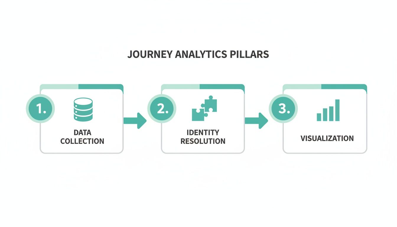
As the visualization highlights, reliable data collection is the critical first step before you can even think about resolving identities or analyzing behaviors.
By automating the discovery, validation, and monitoring process, you shift your team from a reactive, time-consuming QA model to a proactive one. This ensures the data you rely on for customer journey analytics is always accurate and trustworthy, allowing you to make decisions with confidence.
Putting Journey Analytics into Action
Understanding the theory is great, but the real magic happens when you see customer journey analytics solve actual business problems. How does all this data translate into better outcomes? For different teams, it provides the clarity needed to stop guessing and start making data-driven moves.
Let's walk through some practical, real-world applications. We'll explore how marketing, product, and data teams use journey insights to tackle common challenges, breaking down each use case into a simple "Problem," "Analysis," and "Solution" format.
Marketing Use Case: Optimizing Channel Spend
The Problem: The marketing team is pouring money into multiple channels—social media ads, content marketing, email campaigns, you name it. Their problem? They're stuck on a last-click attribution model, which gives 100% of the credit to whatever a customer clicked right before converting. This completely ignores every other interaction that warmed up the lead, giving them a warped view of what's actually working. They have a hunch they're overspending in some places and undervaluing others.
The Analysis: Using customer journey analytics, the team finally stitches together the entire path of their converted users. What they find is eye-opening. While a final email click often gets the glory, a huge chunk of these high-value customers first discovered the brand through a paid social ad weeks earlier. The journey data proves that social ads are a critical "opener," even if they don't land the final punch.
The Solution: Armed with this new perspective, the team ditches last-click and adopts a multi-touch attribution model that spreads credit across the entire journey. They confidently reallocate a portion of their budget back to top-of-funnel social media campaigns. The result? A 15% increase in qualified leads, all without spending a single dollar more on their total ad budget.
Product Use Case: Plugging Onboarding Leaks
The Problem: The product team has a classic, frustrating issue. Users are signing up for a free trial in droves but vanishing within the first 24 hours. Their standard dashboards show a massive drop-off right after the first login, but offer zero clues as to why or where people are getting stuck in the all-important onboarding flow.
The Analysis: By implementing detailed journey analytics, the team can now watch the exact sequence of actions new users take. They quickly spot a major friction point. It turns out that users who skip the optional "Invite a Teammate" step are a staggering 60% more likely to go inactive. The data shows these users get dumped onto a complex main dashboard with no clear next steps, causing them to lose momentum and leave.
The analysis revealed a clear "golden path" to activation. Users who successfully invited a teammate were naturally guided through a collaborative feature. This single action dramatically boosted their understanding of the product's value and made them far more likely to stick around.
The Solution: The product team redesigns the onboarding experience. They make the "Invite a Teammate" step much more prominent and, for those who still skip it, add contextual tooltips to the dashboard. This straightforward fix reduces first-day churn by 25% and drives a significant lift in trial-to-paid conversions. For a deeper dive into this kind of analysis, our guide on customer journey analysis for e-commerce in GA4 breaks down similar principles.
Data Use Case: Uncovering Hidden Paths to Purchase
The Problem: A data analyst is trying to figure out what separates one-time buyers from high-value, repeat customers. The existing dashboards state the obvious: repeat buyers spend more. But they don't explain the behaviors that create that loyalty. The business wants to identify these "super users" much earlier in their lifecycle to nurture them properly.
The Analysis: The analyst uses path analysis to compare the complete journeys of both customer groups. The data uncovers a fascinating pattern: customers who use the "Save for Later" feature on a product page are three times more likely to make a second purchase within 30 days. This small, seemingly insignificant action is actually a powerful leading indicator of high customer lifetime value.
The Solution: This insight is a game-changer and gets shared with both the marketing and product teams. The product team immediately works on making the "Save for Later" button more visible across the site. At the same time, the marketing team spins up a new automated email campaign that reminds users about their saved items, leading to a direct, measurable increase in repeat purchases and customer retention.
Turning Insights into Collaborative Action

Nailing down accurate customer journey analytics is a huge win, but it's really only half the battle. The real magic happens when those insights are shared, understood, and acted on across the entire organization. Let's be honest, raw data tables and dense reports don't inspire anyone to do anything. What teams really need are compelling stories that make the data’s meaning impossible to ignore.
This is where you shift gears from data engineering to data storytelling. The goal is to weave the numbers into a clear narrative that everyone—from marketing and product to engineering and sales—can get behind. When every team sees the same picture, they can finally start rowing in the same direction.
Building Dashboards That Tell a Story
Great dashboards do more than just spit out metrics; they answer critical business questions at a glance. Instead of drowning users in a sea of charts, a well-designed dashboard should guide them through a logical story. It starts with the big-picture outcomes and then lets people drill down into the specific journeys driving those results.
Powerful visualizations are what make this possible, turning abstract data into something you can almost touch.
- Sankey Diagrams: These flow diagrams are brilliant for showing the messy, multi-path journeys customers actually take. They visually represent the volume of users flowing between stages, instantly highlighting the most popular paths and the biggest drop-off points.
- Retention Cohorts: A retention chart is perfect for seeing the long game. It groups users by their sign-up date and tracks how many stick around over time. This gives you a crystal-clear view of long-term engagement and helps you pinpoint which product changes or marketing campaigns actually made a lasting impact.
Visuals like these make customer journey analytics accessible to everyone, not just the data nerds. A great use case here is spotting user friction points before they become a real problem. If you want to dig deeper, check out how to reduce customer churn with data insights to keep your user base happy and healthy.
Fostering a Culture of Data Collaboration
Of course, cool dashboards alone won't cut it. A truly successful analytics program demands a cultural shift away from siloed, departmental thinking. When marketing, product, and engineering are all looking at different data, they're bound to come to different conclusions. That just leads to friction and stalled progress.
The biggest barrier to data-driven growth isn't technology; it's the lack of a shared understanding. Establishing a single source of truth for analytics is the foundational step toward breaking down departmental silos and fostering true collaboration.
When everyone trusts the same numbers, the whole conversation changes. Arguments over whose data is "right" fade away, replaced by collaborative brainstorming on how to fix the problems the data has uncovered. This unified view ensures that a feature update from product aligns with a campaign from marketing, because both teams are working from the same insights into customer behavior. For a deeper look at this, our guide offers best practices for creating unified analytics across platforms.
From Manual Checks to Automated Alerts
To keep that trust in your single source of truth, the data has to stay reliable. A key part of collaborative action is making sure teams get a heads-up the moment something breaks. Waiting for a monthly report to discover a critical conversion event has been broken for weeks is just not an option anymore.
This is where automated monitoring and alerting come in. By plugging analytics QA platforms directly into your team's existing workflows, you create a proactive, real-time feedback loop.
Picture this: an engineer pushes new code that accidentally breaks the AddToCart event.
- An automated observability tool spots the data anomaly within minutes.
- An instant alert pings a dedicated Slack or Microsoft Teams channel.
- The right product and engineering folks are notified immediately, see the root cause, and can roll back the change or ship a fix before it tanks revenue or corrupts your dashboards.
This kind of automation turns data quality from a tedious, periodic audit into a real-time, shared responsibility. It builds confidence across the entire organization that the insights they rely on are always accurate, empowering them to act decisively. This is what closes the loop, turning reliable data into swift, intelligent action.
Common Mistakes to Avoid
Even the most well-thought-out customer journey analytics plans can go off the rails. It’s one thing to launch a new analytics initiative, but it's another thing entirely to keep it delivering real value over the long haul. A few common—but critical—mistakes can be the difference between game-changing insights and a costly, confusing data mess.
Interestingly, these pitfalls usually aren't technical. They're strategic. They come from how teams think about data, what they choose to measure, and how they ultimately use the information they collect.
The Trap of Tracking Everything
The first and most common error is tracking too much noise. Eager to get a "complete" picture, teams often try to instrument every single click, hover, and page view. This approach is a fast track to analysis paralysis, burying valuable signals under a mountain of irrelevant data. Your dashboards get cluttered, and analysts burn out just trying to sift through the noise.
Solution: Start with a solid tracking plan that’s tied to specific business questions. Instead of tracking everything, focus on the "critical path" events—the key actions that actually correlate with conversion, retention, or customer satisfaction. Quality over quantity should be your mantra here.
Ignoring the Offline World
Another classic blunder is focusing only on digital touchpoints while completely ignoring what happens offline. For B2B companies, this could be sales calls, in-person demos, or meetings at a conference. For an e-commerce brand, a customer service call or an in-store return is a huge piece of the puzzle.
When you ignore these offline events, you create massive blind spots in your customer journey analytics. This can lead you to misattribute success or totally misunderstand points of friction. A customer who looks "disengaged" online might actually be having detailed conversations with your sales team offline.
Overlooking Data Governance and Privacy
In the rush to get data flowing, it’s dangerously easy to let data governance slip. This mistake can have serious consequences, from eroding customer trust to facing massive fines for privacy violations under regulations like GDPR or CCPA. Accidentally collecting Personally Identifiable Information (PII) without consent or misconfiguring user permissions can turn your analytics project into a huge liability.
To stay out of trouble, you have to build data privacy into your process from day one. Here’s how:
- Implement Consent Management: Make sure you have clear consent mechanisms in place and that your tracking actually respects user choices.
- Automate PII Scanning: Use tools that can automatically scan your data streams to catch potential PII leaks before they become a full-blown crisis.
- Establish Clear Policies: Create and enforce clear rules on what data can be collected, who gets to see it, and how it can be used.
By sidestepping these common mistakes, you can make sure your investment in analytics delivers real, actionable value instead of just more noise and risk.
Common Questions Answered
As you start working with customer journey analytics, a few common questions always seem to pop up. Let's tackle them head-on to clear up any confusion and help you sidestep the usual hurdles teams face.
How Do You Handle Cross-Device Tracking?
The magic behind tracking users across their different devices is a process called identity resolution. Think of it as stitching together a user's activity from their laptop, phone, and tablet into a single, cohesive story.
This is usually done by linking activity to a stable identifier, like the user ID they get when they log in. Sometimes, it involves more predictive methods that look at signals like IP addresses or browser types to make an educated guess. The end goal is always the same: to map out one complete journey, no matter how many devices a customer uses to interact with you.
What Is the Difference Between Customer Journey Analytics and Web Analytics?
The biggest difference comes down to scope. Traditional web analytics tools are great at giving you a snapshot of what’s happening on a single channel. They focus on aggregated metrics like sessions, pageviews, and bounce rates for your website.
Customer journey analytics, on the other hand, zooms out to see the entire picture from the user's perspective. It connects the dots between multiple channels—your website, mobile app, email campaigns, CRM data, and more—over long periods. This gives you a true end-to-end map of how a person becomes and stays a customer.
How Can We Ensure Our Analytics Is Compliant with Privacy Regulations?
Making sure your analytics setup is compliant with privacy laws isn’t just a good idea; it's a must. This has to be baked into your strategy from day one. It means having solid consent management in place, anonymizing or pseudonymizing personal data, and being completely transparent about what you’re collecting and why.
Relying on manual checks just won't cut it. Automated tools are key to staying compliant as you scale. They can constantly scan for things like accidental Personally Identifiable Information (PII) leaks or consent banners that aren't firing correctly. By flagging these issues in real-time, these systems can save you from a very expensive mistake before it ever happens.
Ready to ensure every insight is built on a foundation of trust? Trackingplan provides fully automated analytics observability to discover, validate, and monitor your entire data implementation in real-time. Stop guessing and start trusting your data.