
Discover how to reduce bounce rate with proven, actionable strategies. This guide covers analytics QA, UX improvements, and technical fixes to boost engagement.
Before you touch a single line of code or rewrite a single headline to fix a high bounce rate, you have to ask a critical question: is the data even right?
It’s a trap I’ve seen countless teams fall into. They spend weeks, even months, overhauling landing pages and tweaking user flows, all based on a bounce rate number that was inflated by technical glitches from the start. A surprisingly high number of websites are flying blind with faulty analytics, chasing a user problem that is actually a data problem.
So, the first real step in learning how to reduce website bounce rate is to pop the hood and audit your analytics setup. You need to be absolutely sure you can trust the numbers staring back at you. Only then can you make smart, effective changes.
Uncovering Hidden Tracking Errors
So, what are these gremlins that artificially inflate your bounce rate? They're usually subtle technical issues that make it seem like users are leaving when they’re actually engaged.
One of the most common offenders is duplicate analytics tags. This happens more often than you'd think, especially after a site migration or when multiple people are working in a tag manager without a clear process. When two identical tags fire on one page load, your analytics tool gets two pageview signals. If a user visits just that one page, the second pageview can confuse the system, often resulting in a session with a single pageview being incorrectly flagged as a bounce.
Another big one is misconfigured event tracking. Not all meaningful interactions involve loading a new page. Think about what your users are actually doing:
- Watching an embedded video.
- Downloading a PDF.
- Submitting a form that doesn't redirect.
- Clicking to expand an FAQ section.
If these actions aren't set up correctly as interaction events in Google Analytics, they're invisible. From your analytics platform's perspective, the user landed, did nothing, and left. That’s a bounce, but it’s not the truth.
This simple flow chart really nails the process of getting to insights you can actually rely on.
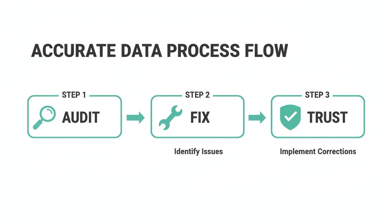
Moving from a messy state of Audit to Fix and finally arriving at Trust is the only way to build a foundation for successful optimization.
To help you get started, here’s a quick rundown of the most common technical issues that can mess with your bounce rate and how you can begin to tackle them.
Common Bounce Rate Inflation Culprits and Solutions
Fixing these issues ensures the bounce rate you're seeing reflects actual user disengagement, not just sloppy tracking.
How to Start Your Data Audit
You can kick off a basic audit yourself using your browser's developer tools. Just open the "Network" tab, refresh your page, and filter for your analytics provider's hits (for GA, that's often "collect"). Seeing multiple pageview hits for one page load is a dead giveaway you have a duplicate tag problem.
For events, you’ll need to dig into your Google Tag Manager setup. Check that important interactions are tracked as events and, crucially, that the "non-interaction hit" setting is correct. If an event shows a user is engaged, it needs to be set to "False." This tells Google Analytics not to count it as a bounce.
A "bounce" should mean a user wasn't interested. A user who downloads your latest whitepaper is clearly interested. Your analytics need to reflect that reality.
Let's be honest, though. Manually checking every tag and event across a large website is tedious and a recipe for mistakes. This is where an analytics observability platform becomes a lifesaver. A tool like Trackingplan automatically scans your site for these problems 24/7. It will catch duplicate tags, misconfigured events, and even cross-domain tracking issues that prematurely end sessions. It’s like having a dedicated QA team for your analytics, making sure bad data never leads you down the wrong path.
Improve Site Speed and Core Web Vitals

Once you’re confident your analytics data is solid, the next front in the war on high bounce rates is pure, unadulterated speed. A slow website isn't just a minor annoyance anymore; it's a clear signal to users that you don't value their time. In a world of instant gratification, every millisecond is a battle.
The link between load time and user retention is brutally direct. We've all seen the data: sites loading in 2 seconds have a staggeringly low average bounce rate of just 9%. But let that drag on to 5 seconds, and the rate skyrockets to 38%. Google’s own benchmarks push for mobile loads under 3 seconds, yet the average U.S. retail site plods along at a sluggish 6.3 seconds.
Think about the business impact. For a site with 10,000 monthly visits, speeding up your pages for a 0.5-point lift in conversions means 50 extra customers without a single extra dollar in ad spend. The numbers don't lie: speed is non-negotiable.
Optimize Your Visual Assets
Let's start with the usual suspect: heavy, unoptimized images. These are almost always the biggest drag on page load. It's time to move beyond basic JPG compression.
Adopting next-gen image formats like WebP can slash file sizes—often by 25-35% compared to older formats—with no noticeable drop in quality. It’s a huge win.
Another game-changer is lazy loading. This simple technique stops images and iframes "below the fold" from loading until a user actually scrolls down to them. The result? Your initial page render is lightning-fast, getting the most important content in front of your visitor almost instantly.
Leverage a Content Delivery Network
Where your server lives matters. If your server is in New York, a user visiting from Tokyo is going to feel the lag as data makes its long journey across the globe.
A Content Delivery Network (CDN) is the answer. It works by caching your site’s assets on a distributed network of servers around the world.
So when that user from Tokyo visits, the CDN serves them images, scripts, and stylesheets from a server nearby. This one change can dramatically cut load times and create a far smoother experience for your international audience, which directly lowers bounce rates. For a deeper dive, check out this excellent guide on how to improve website performance for faster load times.
Every second of delay in mobile page load can impact conversion rates by up to 20%. In the mobile-first world, site speed isn't a feature—it's the foundation of a good user experience.
Audit Your Third-Party Scripts
Here’s a performance killer that many teams completely miss: the ever-growing pile of third-party scripts. Every marketing pixel, analytics tool, chatbot, and A/B testing script adds weight and load time. Each one makes an external network request, and a single slow or broken script can create a bottleneck that grinds your entire page to a halt.
This is where solid analytics governance becomes a crucial part of performance management. You have to know every tag firing on your site and understand the performance hit of each one.
I’ve seen it happen countless times. A marketing team adds a new retargeting pixel, not realizing it’s poorly optimized and adds two full seconds to the load time. Suddenly, the bounce rate creeps up, and everyone is scrambling to figure out why. To get a handle on this, you first need a full inventory of what's running on your site, which is a core part of any proper website audit.
This is exactly the kind of silent killer an analytics observability platform like Trackingplan is designed to catch. By constantly monitoring your entire Martech stack, it can instantly alert you when a new tag is tanking your site's performance. This real-time visibility means you can fix the problem before it damages your user experience and sends your bounce rate through the roof. It’s about being proactive instead of reacting to bad metrics weeks after the fact.
Master Your User Experience and Mobile Design

Once you’ve wrestled your site speed into submission and you’re confident in your analytics, it’s time to look at the user experience (UX) itself. A technically perfect, lightning-fast website can still bleed visitors if it's cluttered, confusing, or just plain difficult to use. A smooth user journey is one of your best defenses against a high bounce rate.
Think of your site's design as a conversation. Is it welcoming you in, or is it shouting at you from across a crowded room? Simple things like a clean navigation menu, readable fonts, and smart use of white space are non-negotiable. They all work together to lower the cognitive load, letting people focus on your message, not on how to use your site.
The Critical First Impression Above the Fold
The content "above the fold"—everything a visitor sees without having to scroll—is your most valuable digital real estate. You get a few precious seconds to answer their two biggest questions: "Am I in the right place?" and "What's in it for me?"
If that initial view is confusing or fails to spell out your value proposition, they're gone. A great above-the-fold experience doesn't just look pretty; it orients the visitor and tells them exactly where to go next.
Take a SaaS landing page, for example. A strong one will hit you with a clear, benefit-driven headline, a quick sub-headline explaining what the tool does, and a big, obvious call-to-action button. It instantly validates why the user is there and points them toward the next step.
Your goal is for a visitor to know what you offer and what they should do next without ever moving their mouse. If they have to hunt for information, you've already lost a good chunk of them.
Shifting to a Mobile-First Mindset
These days, having a mobile-friendly site isn't a perk; it's table stakes. Over 50% of all web traffic now comes from mobile devices, and a bad mobile experience is a one-way ticket to a higher bounce rate. The numbers don't lie: the average bounce rate on mobile is a painful 78.39%, miles higher than the 67.38% on desktop. On top of that, 74% of users say they’re more likely to come back to a site if it's designed for mobile. You can find more web traffic insights over at HubSpot.
And just having a "responsive" design that shrinks down isn't good enough anymore. A true mobile-first approach means you design the experience for the smallest screen first and then scale it up.
This forces you to prioritize what's absolutely essential. It’s not just about looks; it's about pure usability for someone on the go. Buttons need to be big enough for a thumb to tap easily. Forms should be brutally simple, asking only for what you absolutely need. And those intrusive pop-ups? The ones that are a minor annoyance on a desktop can become a prison on a phone, leading to an instant, frustrated bounce.
Your Mobile UX Audit Checklist
Get into the habit of running a mobile UX audit. The best way? Just grab your phone and try to use your own site. Be honest and look for those little points of friction. Here’s a quick checklist to guide you:
- Navigation Clarity: Can you find the main menu without thinking? Are the most important links right there, or are they hiding inside a clunky hamburger menu?
- Button and Link Sizing: Can you comfortably tap every link and button without fat-fingering something else? A tap target of at least 48x48 pixels is the gold standard.
- Form Simplicity: Are your forms short and sweet? Do they use mobile-friendly inputs, like a number pad for phone numbers?
- Readability: Is the font big enough to read without pinching to zoom? Is there enough contrast between the text and the background to read it in bright sunlight?
- Pop-up Behavior: Do any pop-ups or overlays block the content? More importantly, can you close them easily? An un-closeable pop-up is a guaranteed bounce.
- Horizontal Scrolling: Are you forced to scroll sideways to see anything? That’s a dead giveaway that the site isn’t properly optimized for your screen.
Nailing these small but crucial details can make a world of difference. When someone feels like a mobile experience was actually designed for them, they’re far more likely to stick around.
Create Compelling Content with Clear Calls to Action

Even with perfect analytics and a lightning-fast site, people will still leave if your content misses the mark. A high bounce rate is often just a symptom of an "expectation mismatch"—a gap between what a visitor thought they were getting and what your page actually delivered. This is where we close that gap.
The goal is to create compelling content that gives users an obvious path forward. Every page needs a purpose. If someone lands, reads, and has no clue what to do next, you’ve built a dead end. Let's turn those potential bounces into engaged, multi-page sessions by satisfying their intent and guiding them deeper.
Write Headlines That Make and Keep a Promise
Think of your headline as a promise. When someone clicks a link from a Google search or a social post, they arrive with an expectation set by that headline. If your page doesn't immediately deliver on that promise, you've broken their trust. They'll bounce.
Imagine a user clicks on an ad for a "Free Demo Today," but the landing page just has a vague contact form with no mention of a demo. That mismatch creates instant friction. Your ad copy, the SERP title, and your on-page H1 tag must all align perfectly to reassure the user they're in the right place.
If your content doesn't immediately validate the click, the user will feel misled. This is the fastest way to lose a visitor and ensure they don't return.
Structure Content for Scannability
Let's be honest: people don't read websites; they scan them. Your content structure needs to embrace this behavior. A wall of dense text is a huge red flag—it signals that finding the answer will be hard work.
To make your content inviting and scannable, you need to break it up and guide the reader's eye.
- Use Clear Subheadings: Break your topic into logical chunks with descriptive H2 and H3 tags. This creates a scannable outline, letting users jump straight to the section they care about most.
- Keep Paragraphs Short: Aim for one to three sentences per paragraph. Short paragraphs create white space, making the content feel less intimidating and much easier to digest on any screen.
- Integrate Bullet Points: When you're listing features, steps, or key ideas, use bullet points. It’s the easiest way to make complex information digestible at a glance.
- Add Visual Breaks: Use relevant images, charts, or videos to break up long stretches of text. Visuals can re-engage a skimming user and explain complex concepts far better than words alone.
When your content is easy to scan, users find value fast. That's a powerful reason for them to stick around.
Guide Users with Clear Calls to Action
After a user finishes with your content, they're left with one question: "What now?" If you don't provide a clear answer, they'll just leave. Every single page needs a Call to Action (CTA) that gives them an obvious next step. And a CTA isn't always a "Buy Now" button.
Different CTAs serve different goals:
- Primary CTAs: These are your main conversion goals, like "Get a Quote," "Start Free Trial," or "Add to Cart." Make them visually impossible to miss.
- Secondary CTAs: These are for visitors who aren't ready to commit. Think "Download the Whitepaper," "Watch the Demo," or "Sign Up for Newsletter." They offer a lower-commitment next step.
- Internal Links: These are your simplest CTAs. They guide users to related blog posts, case studies, or feature pages. Always use descriptive anchor text like "Learn more about our analytics monitoring" instead of a generic "click here."
CTA placement is just as important as the CTA itself. Put your primary CTA above the fold and repeat it after key sections. Sprinkle relevant internal links throughout your content to create a natural journey from one page to the next. By providing a clear path, you turn a passive reader into an active participant and slash your bounce rate.
Keep Your Improvements on Track with Continuous Monitoring and Analytics QA
Getting your bounce rate down is a huge win, but it's not a "set it and forget it" kind of project. This is an ongoing discipline. All the hard work you put into site speed, UX tweaks, and content improvements can be wiped out in an instant by a single bad code deployment or a rogue marketing pixel.
To protect your progress, you have to shift from a reactive mindset—fixing problems as they pop up—to a proactive one. It’s about building a resilient system for continuous validation and quality assurance. Without it, you're just putting out fires instead of building a better product.
The heart of this system is experimentation. Every change you make to reduce bounce rate is really just a hypothesis. You believe a clearer CTA will work better, or a redesigned header will improve navigation. A/B testing is how you prove it.
Validate Your Changes with A/B Testing
Setting up controlled experiments is the only real way to know if your changes are actually moving the needle. You show one version of a page (the control) to one group of users and a new version (the variation) to another. This lets you measure the real-world impact on user behavior.
This scientific approach takes the guesswork out of the equation and lets the data do the talking. For instance, you could test things like:
- Different headlines: Does a benefit-driven headline lower bounces more than a question-based one?
- CTA button placement: Will moving the button above the fold encourage more clicks and longer sessions?
- Content format: Does a short video explainer keep users on the page longer than a big block of text?
Just make sure you run each test long enough to reach statistical significance. A small, short test might show a 10% drop in bounce rate, but without enough data, that could easily be random chance. Once a variation proves to be a clear winner, you can confidently roll it out to everyone.
The Big Problem with Manual Audits
While testing your front-end changes is critical, that's only half the battle. What happens when the very tools you use to measure those tests break? This is where the real risk is hiding.
Manual analytics audits are slow, expensive, and outdated the second you finish them. A developer might accidentally remove a dataLayer variable, or a marketer could add a new tag that conflicts with your existing setup. All of a sudden, your A/B test data is polluted, your bounce rate metric is shot, and you're back to making decisions in the dark.
A manual analytics audit is a snapshot in time. Continuous, automated monitoring is a 24/7 motion picture of your data quality, catching errors the moment they happen.
This is why proactive, automated monitoring of your analytics is completely non-negotiable for anyone serious about sustainably reducing their bounce rate.
Implement Automated Analytics QA
To build a truly resilient system, you need an automated watchdog that's constantly scanning your analytics implementation for errors. This is where a platform like Trackingplan becomes indispensable. It essentially acts as a dedicated QA layer for your entire analytics and Martech stack, ensuring your data stays trustworthy.
Imagine your team deploys a site update on a Friday afternoon. Unbeknownst to them, the update breaks the event tracking for your "Request a Demo" button. Without automated monitoring, you might not catch this until Monday morning—after you've lost an entire weekend of valuable lead data and your bounce rate for that page has artificially skyrocketed.
With an analytics QA platform in place, you’d get a real-time alert via Slack or email the moment the broken event is detected. This allows your team to fix the issue immediately, before it corrupts your reports and invalidates your test results.
This constant vigilance covers a whole range of potential problems:
- Broken Events: Get alerted when critical user interactions suddenly stop firing.
- Schema Mismatches: Detect when data is being sent in the wrong format or with missing values.
- Rogue Pixels: Identify unauthorized tags added by third-party tools that could be slowing your site or causing tracking conflicts.
- Missing Properties: Ensure all the necessary data points are being collected with every single event.
By creating this safety net, you build a cycle of trust. Your A/B test results are reliable, your bounce rate data is accurate, and your team can focus on making genuine improvements—confident that the foundation they're building on is solid.
Common Questions About Reducing Bounce Rate
Even with a solid plan, a few questions always pop up when you're trying to wrestle your bounce rate down. I've gathered some of the most common ones here to give you quick, practical answers and reinforce the key ideas.
Think of this as your go-to reference while you’re fine-tuning your site’s performance and user engagement.
What Is a Good Bounce Rate Anyway?
Honestly, there's no single magic number. What's "good" is completely dependent on your industry, your audience, and the type of content on the page. While many websites aim for a bounce rate below 40%, the benchmarks are all over the place.
For instance, an e-commerce site might see rates in the 35-40% range, which makes sense because visitors are actively clicking around and browsing products. On the other hand, a blog post could have a bounce rate closer to 50-60%, and that's perfectly fine. If someone landed on your article, found the answer they needed, and left satisfied, that’s a win—even if it counts as a bounce.
The best way to measure success is to benchmark against your own historical data and your direct competitors. A sudden spike in your bounce rate is a much bigger red flag than comparing your SaaS blog to a retail homepage.
How Is GA4 Bounce Rate Different from Universal Analytics?
This is a huge one, and the change is for the better. The old Universal Analytics (UA) was pretty crude: if a user visited only one page and left, it was a bounce. It didn't matter if they spent five minutes reading every word on that page.
Google Analytics 4 (GA4) completely redefined it. In GA4, bounce rate is simply the inverse of engagement rate. A session is considered "engaged" if the user does one of three things:
- Stays on the site for more than 10 seconds
- Triggers a conversion event
- Views at least two pages
If a session doesn't meet any of those criteria, then it's a bounce. This gives you a much more meaningful metric. It correctly understands that someone who spends 30 seconds reading your content is fundamentally different from a visitor who hits the back button instantly. For a bit more on session metrics, you can also explore the key differences between exit rate vs bounce rate.
My Bounce Rate Suddenly Spiked. What Should I Do?
A sharp, unexpected jump in bounce rate is almost always a sign that something's broken. The first rule is don't panic. Before you start questioning your content or UX, you need to investigate the technical side of things.
Start by looking at any recent website updates or code deployments. Did a bug slip through? Common culprits are broken links, scripts that prevent interactive elements from working, or a misconfigured analytics tag. A simple tracking error, like a duplicate tag firing on every page, can instantly wreck your data and create an artificial spike. This is exactly why having continuous, automated monitoring in place isn't a luxury—it's essential for maintaining data you can actually trust.
Ready to stop guessing and start trusting your analytics data? Trackingplan provides 24/7 automated QA to catch tracking errors, broken pixels, and data inconsistencies before they skew your metrics. Get started for free today and build your optimization strategy on a foundation of trust.