
Your reporting stack probably looks functional from a distance. There's a dashboard for paid media, another for CRM, a spreadsheet that “reconciles” everything, and a Slack thread where people ask why Meta conversions don't match GA4. The issue isn't that you lack charts. It's that your team doesn't fully trust the data feeding them.
That's why the conversation around an AI marketing dashboard needs more discipline. Marketing teams often don't need prettier visualization. They need a system that can unify fragmented data, surface issues fast, and help people act before bad inputs distort spend decisions, forecasting, and attribution. If the tracking layer is weak, the AI layer just automates confusion.
The category is getting too big to ignore. The global artificial intelligence in marketing market was valued at $20.44 billion in 2024 and is projected to reach $82.23 billion by 2030, according to Grand View Research's AI in marketing market report. That growth tells you something important. AI-powered analytics is moving from experimental tooling into the standard operating stack for marketing teams.
Beyond Spreadsheets and Static Charts
Marketing teams usually hit the same wall in stages. First, one analyst builds a spreadsheet to blend Google Ads, Meta, HubSpot, and Shopify data. Then another team adds a BI dashboard. Then leadership asks for daily visibility, channel comparisons, and explanations when performance swings. Suddenly the setup that felt “good enough” becomes fragile.
Static charts fail because they assume the job is done once data is visualized. It isn't. Someone still has to validate definitions, catch broken events, explain discrepancies, and figure out whether a change in performance is real or just a tracking problem. A chart that's a week late is frustrating. A chart that's wrong is dangerous.
A useful dashboard has to support decisions, not just display metrics. That means real-time inputs, role-specific views, alerting, and enough context to tell a marketer what changed and where to investigate next. The practical standard is closer to an operating console than a monthly report. If you want a good baseline for that, Trackingplan's guide on analytics dashboard features that drive real decisions is worth reviewing.
Why the old reporting workflow breaks
Three failure modes show up again and again:
- Manual reconciliation spreads errors. Every export, copy-paste step, and sheet formula creates another place where definitions drift.
- Channel dashboards stay siloed. Google Ads can look healthy while CRM quality drops, and nobody sees the connection quickly enough.
- Lag hides operational problems. By the time a team notices missing events or broken campaign tagging, budget has already moved.
Static reporting tells you what happened. A modern dashboard needs to tell you what changed, why it matters, and whether the underlying data is trustworthy.
That's the difference AI changes when it's implemented well. Not more charts. Better detection, faster interpretation, and fewer blind spots.
What Is an AI Marketing Dashboard
A traditional dashboard is like a printed road map. It can show where you've been, but it won't help much when traffic changes, a road closes, or your destination shifts. An AI marketing dashboard is closer to live GPS. It ingests current conditions, detects anomalies, forecasts likely outcomes, and suggests what to do next.
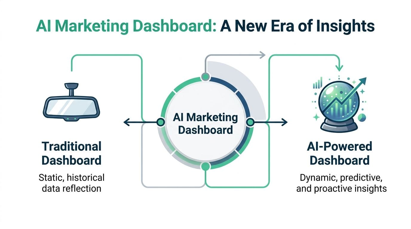
That doesn't mean “AI” magically fixes messy analytics. It means the interface can move beyond passive reporting if the upstream data is connected and normalized correctly. In practice, the dashboard should do three jobs at once: collect data automatically, analyze patterns across channels, and return usable recommendations instead of forcing every user to dig through tabs.
The three functional pillars
Automated aggregation
The first job is data collection. A real AI dashboard automatically pulls data from ad platforms such as Google Ads and Meta Ads, email tools like Klaviyo and Mailchimp, and CRMs such as Salesforce and HubSpot. It should also support common paid, organic, and ecommerce sources without forcing the team into custom APIs or middleware. That basic definition aligns with this breakdown of AI marketing analytics capabilities.
Intelligent analysis
The second job is interpretation. Good systems don't stop at charting spend and conversions. They identify patterns, detect deviations, and forecast likely movement based on historical behavior and current inputs. They can also make the interface more accessible through natural language search and guided drill-downs.
If you want a platform-specific look at how this thinking applies to ad analysis, AdStellar AI's insights dashboard offers a useful reference point for how AI can structure campaign interpretation.
Recommended action
The third job is the one most dashboards still miss. The system should push the user toward action. If CAC rises in one segment, the dashboard should surface the campaigns involved, flag what changed, and narrow the next step instead of leaving the analyst to start from zero.
What it should feel like in daily use
A strong AI dashboard changes the workflow in simple ways:
- Less assembly work. Teams spend less time exporting and stitching together reports.
- Faster diagnosis. Issues surface earlier because the system is watching for deviations continuously.
- Broader access. Non-technical marketers can query the system without waiting on SQL support.
- Clearer prioritization. The interface highlights what deserves attention now, not every metric equally.
That's a significant shift. The dashboard stops being a mirror and starts acting like an analytical co-pilot.
Core Capabilities of Modern AI Dashboards
The fastest way to tell whether a platform deserves the AI label is to look at what work it removes. If the dashboard still depends on manual exports, manual QA, and manual interpretation, it's a reporting layer with AI branding.
The operational upside is real when the implementation is sound. AI-driven advertising displayed within these dashboards delivers a 41% higher conversion rate compared to traditional methods, and teams using them report a 44% increase in productivity, saving 11 to 13 hours per week, according to this roundup of AI adoption, ROI, and marketing performance data.
Anomaly detection that catches what humans miss
Problems are often not noticed immediately, but rather after spend rises, leads soften, or revenue reviews go sideways. A modern dashboard should monitor performance continuously and flag unusual movements early.
Before AI support, a paid media lead might discover a conversion drop during a weekly review. After AI support, the dashboard can flag the deviation as it appears, point to the affected campaign or audience, and narrow the likely cause.
Practical rule: If anomaly detection only tells you that “something changed” without identifying the likely source, it still leaves too much diagnostic work on the team.
Predictive analysis that helps with allocation
Forecasting matters when marketers need to decide where to move budget, which campaigns to scale, or whether current pacing will miss pipeline goals. The useful test isn't whether a dashboard claims predictive analytics. It's whether the prediction helps someone make a better trade-off.
A mature setup can help answer questions such as:
- Budget pacing. Are current channel trends likely to overspend or underspend before the end of the period?
- Creative fatigue. Is a decline isolated to one campaign or spreading across a creative set?
- Lead quality drift. Are top-funnel gains producing weaker downstream outcomes?
That's also where agentic tooling is changing the category. Trackingplan's article on agentic analytics tools is a good example of where dashboards are heading when analysis becomes more proactive.
Natural language access for non-analysts
Natural language querying is one of the most practical improvements when it's done well. It lets channel managers and growth teams ask direct questions without waiting in the analytics queue. The value isn't novelty. It's reduced friction.
A useful dashboard should let a marketer ask for campaign comparisons, time-period changes, or funnel breakdowns in plain language and get a clear path to drill deeper. But there's a catch. This only works when naming conventions, metric definitions, and normalized data are stable. Otherwise the system produces polished answers to poorly structured questions.
Recommendation layers that prioritize action
The best systems don't just show movement. They rank issues by likely business impact. That matters because every dashboard can generate noise. Few can tell a team what deserves attention first.
What works:
- Action-oriented summaries
- Root-cause hints
- Role-specific alerts
What doesn't:
- Generic insight feeds
- Too many KPIs on one screen
- AI summaries detached from source-level detail
An AI dashboard earns its keep when it shortens the distance from signal to decision.
Understanding the Dashboard Architecture
A lot of dashboard buying mistakes happen because teams evaluate the interface and ignore the plumbing. The front end might look polished, but the reliability of the output depends on how the system ingests, standardizes, and serves data underneath.
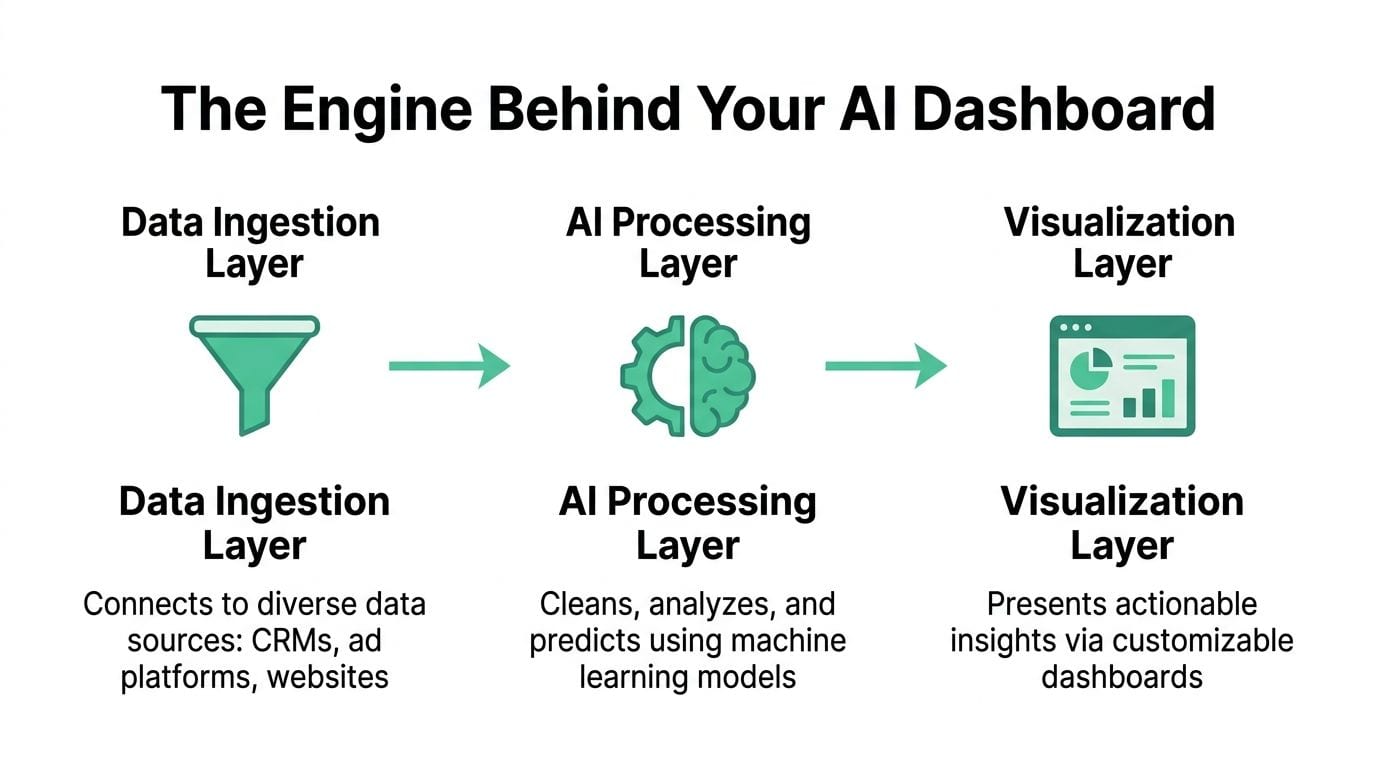
The typical architecture has three layers. You don't need to be an engineer to evaluate them, but you do need to know what each layer is supposed to protect.
Data ingestion layer
The dashboard establishes connectivity with source systems. The ideal setup uses authenticated connections to pull data on a scheduled or real-time basis from ad platforms, CRMs, analytics tools, and ecommerce systems.
A key function here is native integration. AI dashboard architecture can integrate 500+ data sources natively, including Google Ads, Meta, LinkedIn, Salesforce, and HubSpot, which removes the need for manual pipelines and supports real-time streaming, as described in Improvado's overview of AI dashboard architecture.
Normalization and AI layer
Raw platform data is inconsistent by default. Google Ads and HubSpot don't structure records the same way. Naming conventions drift. Fields vary by source. The normalization layer converts that mess into a common model.
This is also where machine learning features sit. Anomaly detection, pattern recognition, and plain-language summaries all depend on standardized data definitions. If this layer is weak, the dashboard can still look smart while producing unstable interpretations.
Visualization and action layer
This is the user-facing part. It includes the dashboard interface, mobile views, natural language access, drill-down paths, and alerting. People often overfocus on this layer because it's visible. In practice, it's only as good as the first two.
A quick vendor check helps here:
| Layer | What to ask | Why it matters |
|---|---|---|
| Ingestion | Which platforms connect natively? | Reduces custom engineering and refresh delays |
| Normalization | How are metrics standardized across sources? | Prevents mismatched definitions and false comparisons |
| Visualization | Can users drill from summary to root cause quickly? | Makes the dashboard operational, not decorative |
The interface is where users see insight. The architecture is where trust is won or lost.
Ensuring Data Quality for Trustworthy AI
This is the part most AI dashboard content skips, and it's the part that determines whether the whole system is useful. Garbage in, garbage out still applies. AI doesn't cancel that rule. It amplifies it.
If your tracking layer has broken pixels, missing events, schema mismatches, rogue tags, or messy UTM conventions, the dashboard can still generate forecasts, summaries, and recommendations. They'll just be confidently wrong. That's worse than having no AI at all because teams act on false certainty.
The scale of the issue isn't minor. AI dashboard guides rarely discuss data quality, yet 72% of companies struggle to turn analytics into action because their underlying data is unreliable, according to Mod Op's analysis of why decision engines fail without trustworthy data.
What data observability actually protects
Data observability is the discipline of monitoring the analytics layer itself. Not just whether a dashboard loads, but whether the data arriving underneath it is complete, consistent, and valid. In practical marketing terms, that means checking for problems such as:
- Missing events that erode parts of the funnel
- Broken or duplicate pixels that distort attribution
- Schema mismatches that break downstream reporting logic
- UTM errors that scramble channel grouping
- Consent and privacy misconfigurations that alter what gets collected
A lot of teams still treat these as implementation bugs to fix only when someone notices them. That approach doesn't scale. Once AI starts summarizing trends and recommending actions, undetected measurement errors become strategic errors.
Why observability matters more with AI
In a traditional dashboard, bad data leads to bad reporting. In an AI dashboard, bad data leads to bad reporting plus flawed pattern detection, flawed anomaly interpretation, and flawed next-step recommendations. The system compounds the problem because it's designed to move faster than manual review.
If your team is evaluating QA disciplines beyond dashboards, this data drift detection guide gives useful context on how model and data behavior can diverge over time.
What a disciplined team does differently
Teams that trust their dashboards usually operationalize a few habits:
- Validate collection before visualization. Don't start with charts. Start with event quality.
- Monitor schema changes continuously. A renamed property can break reporting logic.
- Alert in real time. Detection has to happen when the issue starts, not during a monthly audit.
- Keep a current tracking plan. AI can't interpret what the organization itself hasn't defined clearly.
Trackingplan's article on data quality best practices is useful here because it focuses on the layer most dashboards assume away.
For teams that want a more visual walkthrough, Trackingplan also publishes product and observability videos on the Trackingplan YouTube channel. That's a practical way to see how analytics QA and alerting work in day-to-day operations.
If you can't trust the events, you can't trust the insights. If you can't trust the insights, the AI layer is just speeding up bad decisions.
Implementation and Vendor Selection Checklist
A team signs an AI dashboard contract on Monday. By Friday, the screenshots look polished, the alerts are firing, and the first executive review still goes sideways because paid social conversions are inflated, CRM stages do not match, and nobody can explain which source is wrong. That is a data operations failure, not a dashboard failure.
Implementation works when teams treat data quality as part of the product, not as cleanup work after launch. AI can summarize patterns, flag anomalies, and suggest next steps. If event collection is unstable or metric definitions vary by source, the AI layer only produces faster confusion.
A practical rollout starts small. Limit the first version to a few business decisions, a short source list, and a pilot window long enough to expose tracking problems under normal campaign activity. The goal is not to launch a flashy dashboard. The goal is to prove that the numbers hold up when people start using them.
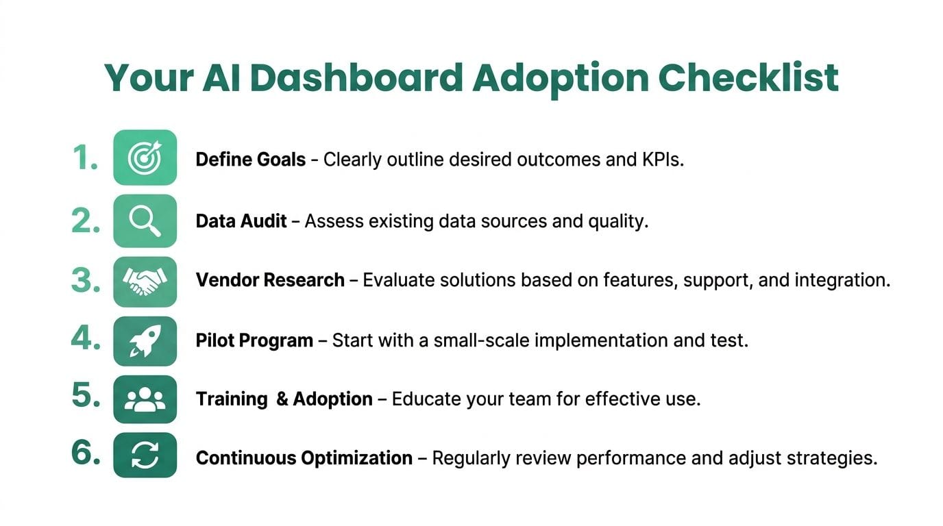
A six-step rollout that works
Define the decisions first
List the decisions the dashboard must support, such as budget pacing, lead quality review, campaign anomaly detection, or channel contribution analysis. If a metric does not inform a decision, it does not belong in the first release.Audit your source data
Check event coverage, naming consistency, campaign tagging, refresh behavior, and ownership of core metrics before you connect anything. This is the step many teams rush, and it is usually where trust is won or lost.Shortlist vendors based on workflow fit
Compare tools against your real operating process. Look at how each vendor handles QA, investigation, alert triage, and metric governance, not just how clean the demo dashboard looks.Run a proof of concept with live conditions
Use production data and known messy cases. Ask the vendor to show how the system responds to broken tags, schema changes, delayed syncs, and conflicting source values.Train by role
Executives need decision views. Channel managers need drill-downs. Analysts and QA owners need traceability back to source logic. One interface can serve all four groups only if permissions and views are designed deliberately.Review and refine continuously
Dashboards degrade when metric definitions drift, channels get added without governance, or alerts stay noisy for too long. Schedule recurring reviews for taxonomy, alert quality, and source reliability.
Required vendor evaluation criteria
Vendor selection should center on one question. Can this platform help your team trust the output when the input gets messy?
That means evaluating the AI layer and the observability layer together. A vendor that forecasts performance but cannot detect missing events, broken pixels, or schema mismatches is asking your team to trust conclusions built on unstable inputs. That trade-off rarely ends well.
If you want a sense of how vendors position applied AI across different operational scenarios, review these Vision platform use cases. Then bring the conversation back to your own environment. Ask what happens when source data changes without warning, how quickly the platform surfaces the issue, and who gets alerted.
AI Marketing Dashboard Vendor Selection Criteria
| Evaluation Criteria | Key Questions to Ask | Why It Matters |
|---|---|---|
| Data integration depth | Which ad platforms, analytics tools, and CRMs connect natively? | Native connectors reduce engineering dependency and lower refresh failure risk |
| Normalization logic | How does the platform standardize metrics across sources? | Prevents false comparisons across channels |
| AI usefulness | Does the system detect anomalies, forecast trends, and recommend actions with enough business context to verify them? | Distinguishes operational help from generic AI labeling |
| Data quality controls | How are broken pixels, schema issues, missing parameters, and tagging errors detected? | Protects downstream reporting and model output |
| Observability and alerting | Can the team see collection failures quickly and route alerts to Slack, email, or Teams with enough detail to investigate? | Cuts time between issue creation and issue response |
| Role-based usability | Can executives, marketers, analysts, and QA teams each access the views they need? | Keeps adoption high and reduces interface clutter |
| Auditability | Can users trace an insight back to source records, transformation logic, and refresh history? | Builds trust and speeds debugging |
| Implementation burden | What setup, maintenance, and QA work still falls on internal analytics or engineering teams? | Reveals hidden cost and slower time to value |
Ask every vendor to demonstrate how they handle bad data in real conditions. Clean demos are easy. Trustworthy AI depends on what happens after tracking breaks.
Real-World AI Dashboard Use Cases
The best way to evaluate an AI marketing dashboard is to picture how it changes ordinary operating problems, not aspirational ones. The patterns below are common because they sit right at the intersection of reporting, diagnosis, and decision-making.
Ecommerce performance triage
An ecommerce team sees conversion softness in paid social. A standard dashboard shows spend, clicks, and revenue trends, but it doesn't explain whether the issue is creative fatigue, landing page friction, feed quality, or tracking loss.
An AI dashboard can narrow the search by flagging the specific campaigns or audience segments that moved abnormally, then surfacing related metrics that shifted at the same time. The team still has to make the decision, but they don't waste half the day locating the problem.
B2B funnel quality review
A B2B SaaS team often has the opposite issue. Top-of-funnel volume looks healthy, but pipeline contribution gets weaker later. Basic reporting can hide that because it overweights lead count and underweights downstream quality.
A stronger dashboard helps by connecting ad, CRM, and lifecycle data in one view, then surfacing where lead quality diverges by channel, campaign, or audience. That changes the conversation from “which channel generated more forms” to “which channel generated opportunities the sales team desires.”
Content and AI search visibility monitoring
Content teams are running into newer visibility problems. Traditional SEO reporting still leans heavily on clicks and rank, but AI-generated answer surfaces don't behave the same way. Teams need dashboards that can adapt to synthesized visibility, citation presence, and branded demand signals rather than pretending old click metrics explain everything.
If you want examples of applied AI workflows in adjacent areas, Vision platform use cases are a helpful way to think through where AI interfaces can become operational tools rather than passive reporting views.
What ties these examples together is simple. The dashboard matters less as a display layer and more as a system for focusing the team on the right next question.
Frequently Asked Questions
Is an AI marketing dashboard the same as Tableau or Power BI
Not necessarily. A standard BI tool visualizes data well, but an AI marketing dashboard is expected to do more. It should detect anomalies, interpret changes, support natural language access, and guide action. Some BI tools can support that with enough setup, but the workflow isn't the same by default.
Should you build or buy
If your team has strong engineering and analytics resources, building parts of the stack may make sense. Teams frequently underestimate the maintenance burden. Connectors break, schemas drift, metric definitions change, and alerting needs tuning. Buying usually wins when speed, governance, and cross-team usability matter more than full custom control.
What about cost
Cost depends on connector depth, implementation work, user roles, and governance needs. The practical mistake is focusing on license price alone. The full cost includes setup time, internal maintenance, QA effort, and the business cost of acting on unreliable data.
Do AI dashboards create privacy risk
They can if the data layer is unmanaged. The risk isn't just the dashboard interface. It's what gets collected, where it flows, and whether tagging and consent rules are enforced consistently. Governance and observability matter as much here as analytics.
What's the first thing to fix before adopting one
Fix tracking quality. If events, schemas, and campaign tags are unstable, adding AI first won't solve the problem. It will hide it behind smarter-looking output.
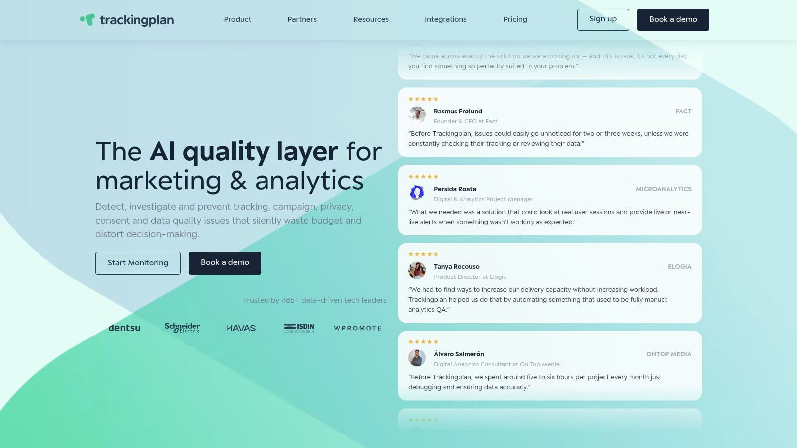
If your team wants an AI marketing dashboard you can trust, start one layer lower than the dashboard itself. Trackingplan helps teams monitor analytics quality, detect broken pixels and schema issues in real time, and keep the data feeding dashboards clean enough for reliable AI insights.