
The most popular advice on user journey mapping is also the part that usually breaks it. Teams gather in a workshop, cover a wall in sticky notes, agree on a clean narrative, and call it insight. Then they compare that neat story with a dashboard a week later and realize the numbers don't line up.
That mismatch isn't a small execution issue. It's the central problem. A journey map is only useful when the path you drew can be reconciled with the path users took, and with the reality of whether your analytics captured that path correctly. If the map says users struggled at checkout but the checkout event is broken, the team will optimize the wrong thing. If the map says onboarding is smooth but support logs show repeated confusion, the poster on the wall is lying.
For data teams, user journey mapping matters less as a UX artifact and more as an operating model. It forces product, analytics, marketing, support, and QA to agree on three things: what the user is trying to do, what should be tracked at each step, and what evidence is trustworthy enough to act on.
Beyond Sticky Notes Why Your Journey Map Fails Without Data
A lot of journey maps fail because they're built as stories first and validated later, if they're validated at all. That's backwards. Industry data shows that 60% of customer journey maps are based on assumptions rather than real data, which is one reason they fail as strategy tools instead of becoming working documents for decision-making, as noted in this analysis of UX journey mapping gaps.
The problem with empathy-only mapping
Empathy matters. Interviews matter. Workshops matter. But they don't replace behavior.
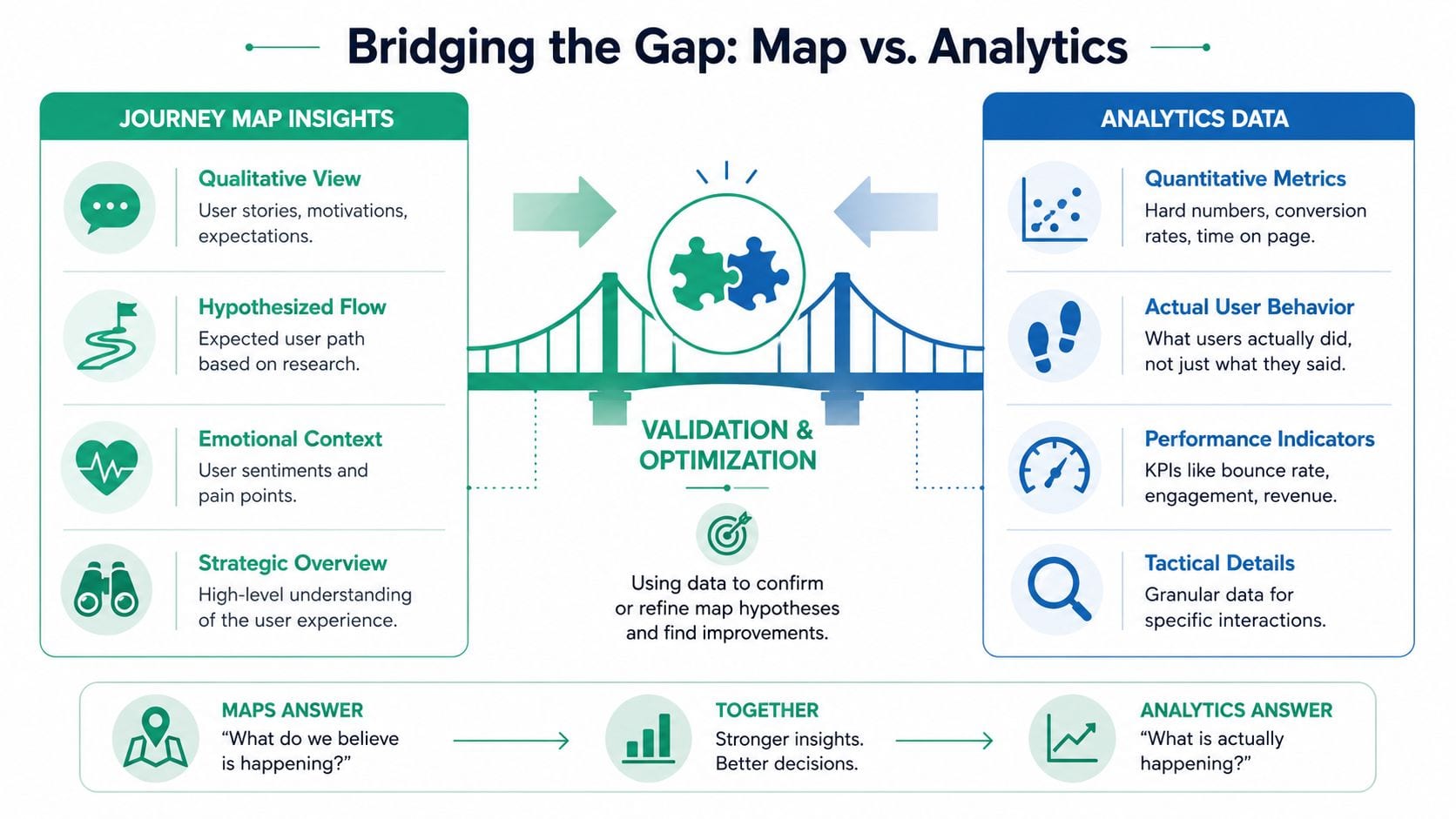
A user may say they compare plans before signing up. Your analytics may show many users jump directly from a pricing page to a support article, then return later through email. Both can be true. The interview gives motive. The analytics gives sequence. Without both, user journey mapping turns into a simplified narrative that misses the messy reality of digital behavior.
That's especially obvious in ecommerce. If you're working through channel overlap, return visits, and product discovery loops, a practical resource on mapping ecommerce customer journeys helps frame the complexity better than a single linear funnel.
Practical rule: If a journey map can't be compared against real event flows, it's a workshop output, not an operational tool.
Why data teams should care
Most UX guides stop at touchpoints, emotions, and pain points. Data teams need one more layer. They need to know whether each touchpoint has a reliable event, whether the event schema is stable, and whether the tracked sequence can support the conclusions the map implies.
That's where many organizations get stuck. The map says “drop-off.” The analyst says “maybe.” The developer says “that event was renamed last sprint.” The marketer says “the campaign click isn't attributed.” Everyone is looking at a different version of the journey.
This is why data quality belongs inside the mapping process, not after it. A useful map should help teams ask:
- What should happen: The intended path, from the user's point of view.
- What did happen: The observed path in analytics.
- What can be trusted: Whether the implementation behind that observation is sound.
If you need a grounding point for that last question, this explanation of why data quality matters for business success is worth reading before you map another “insight” from unreliable tracking.
Assembling Your Journey Mapping Toolkit
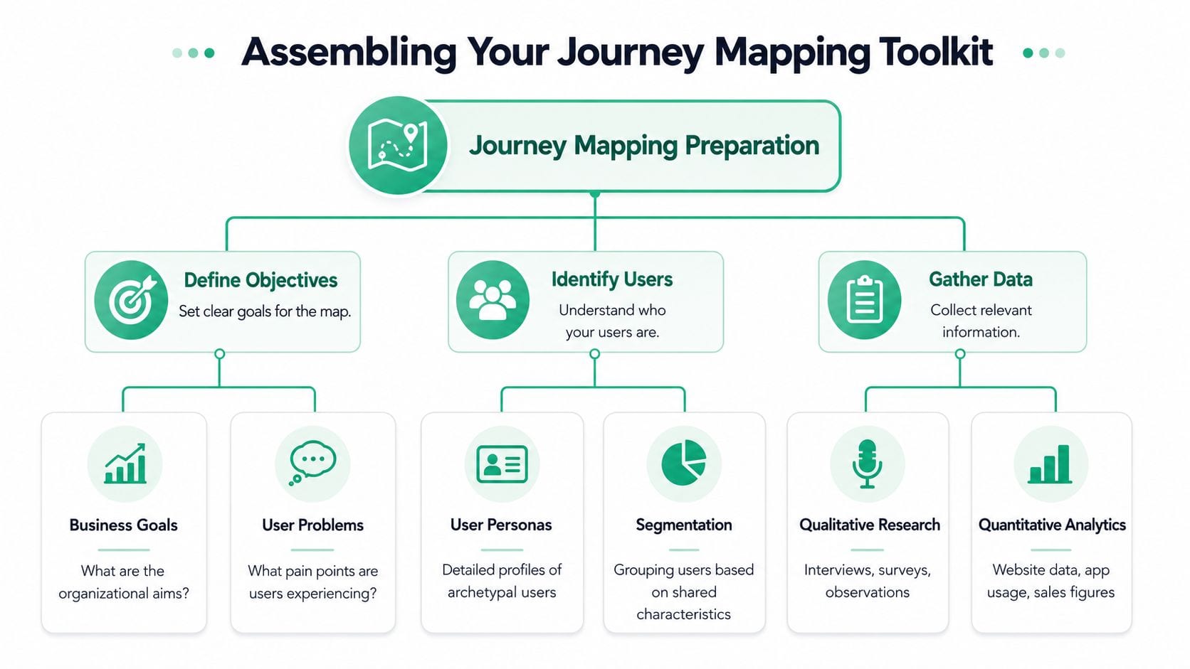
Journey maps break down long before the workshop breaks down. They fail in prep. Teams walk in with partial research, fuzzy scope, and no clear view of what the product tracks. The result is a polished artifact that cannot be checked against behavior.
Start with scope before research
Choose one journey that ends in a user outcome your team can observe. Broad prompts like “map the customer lifecycle” produce diagrams that mix acquisition, onboarding, support, and retention into one story. That story feels complete and usually hides the actual problem, which is that each stage depends on different systems, different owners, and different tracking quality.
A usable scope has a concrete start condition and a concrete end condition. The Nielsen Norman Group's user journey mapping guidance is helpful here because it treats the journey as a bounded scenario, not an attempt to document everything a customer could ever do.
Examples of workable scopes include:
- Signup to first successful action
- Product discovery to completed purchase
- Trial activation to feature adoption
- Support issue raised to issue resolved
Small scope wins for a practical reason. It gives analysts and implementers a fair chance to verify whether the mapped path exists in event data, CRM records, or support systems.
Gather the five source types first
Journey maps improve when the inputs disagree a little. If every source tells the same story, the team is probably looking at the same bias through five different tools.
Before sketching, pull from five source types: customer support logs, web analytics, social media, competitive intelligence, and direct customer interviews or surveys, as outlined in this journey mapping walkthrough.
Each source answers a different question:
- Customer support logs: What users report when progress stalls or breaks.
- Web analytics: Which paths are common, where sessions split, and which steps are skipped.
- Social media: How people describe expectations and frustration in their own words.
- Competitive intelligence: Which interaction patterns users may already expect from the category.
- Interviews or surveys: Why someone hesitated, compared options, or gave up.
The trade-off is time. Interviews explain intent but take coordination. Analytics is fast to query but weak at explaining motive. Support data is rich in pain points but biased toward users who complain. Good prep does not pretend these sources are interchangeable. It uses each one for the question it can answer well.
Add an implementation view
This is the missing layer in many journey-mapping exercises. Prepare an instrumentation inventory before the workshop starts. List the events, properties, destinations, identifiers, and known dependencies tied to the journey you are mapping.
A simple prep table works well:
| Input | What to collect | Why it matters |
|---|---|---|
| User research | Interviews, survey responses, support themes | Adds context and intent |
| Behavioral data | Event flows, page paths, session patterns | Verifies sequence and branching |
| Tracking design | Event names, parameters, schemas | Confirms what can actually be measured |
| Channel context | Paid, email, organic, CRM touchpoints | Prevents a web-only view |
| Competitor patterns | Key flows and expected interactions | Exposes missing steps |
This is also the right moment to inspect the implementation surface, not just the reporting layer. A documented data layer strategy for web analytics and tag management gives the team a stable reference for what should fire, with which parameters, and under which conditions.
I usually ask three questions before the session starts: which events define success, which events mark friction, and which parts of that sequence are known to be unreliable. That changes the discussion. Teams stop arguing about abstract drop-off and start identifying whether the drop-off is behavioral, technical, or both.
A journey map without implementation context creates false confidence. The team leaves with opinions about user behavior when the real issue may be missing events, broken attribution, or inconsistent schemas.
Prepare the workshop like an analyst, not only a facilitator
Workshop design matters because the room will fill gaps with opinion unless the structure pushes people back to evidence. The University of Oxford's UX journey mapping methodology offers a practical format: use a representative cross-functional group, spend focused time on each stage, and prioritize findings instead of treating every note as equally important.
That approach works because it controls two common failure modes. One stakeholder cannot dominate the map through confidence alone. The group also has enough time to separate actions, questions, blockers, and dependencies instead of compressing everything into labels such as “browse” or “buy.”
For analytics and data teams, one addition makes the workshop much stronger. Bring a small evidence pack. Include a path exploration, a few example sessions, key support themes, and a list of tracking caveats for the journey. Do not bring twenty dashboards. Bring enough proof to test assumptions in the room and enough implementation detail to flag where the map is outrunning the instrumentation.
Structuring and Visualizing the User Journey
A useful map needs structure. Without it, teams cram everything into one canvas and end up with a diagram that looks exhaustive but can't be read, debated, or maintained.
Use a standard horizontal flow
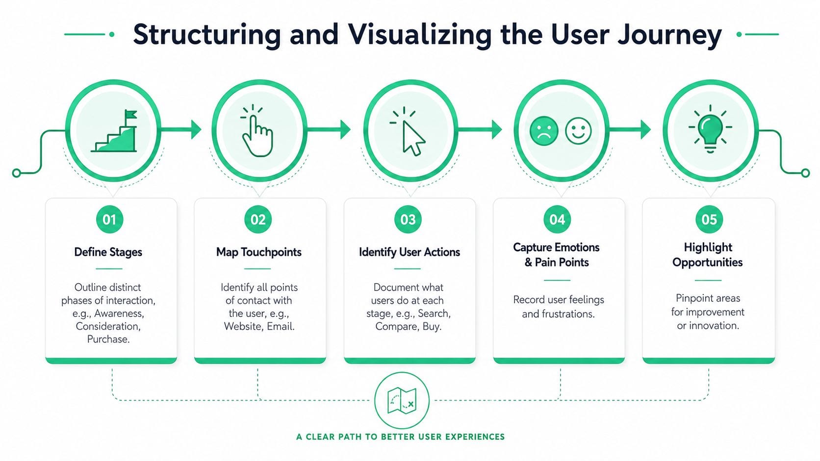
The horizontal axis should show time and sequence from first interaction to last. One framework divides the map into four standard horizontal phases: awareness, consideration, version, and adoption, which keeps maps with many touchpoints readable, based on this instructional walkthrough.
Whatever labels you choose, the key is consistency. A stage should describe a meaningful shift in user intent, not just an internal team handoff.
For example:
- Awareness: The user recognizes a need and discovers options.
- Consideration: The user evaluates fit, risk, cost, or effort.
- Version: The user tries, configures, or moves toward a concrete choice.
- Adoption: The user completes the task and starts using the product in a sustained way.
If your business uses different terminology, that's fine. But don't let every department rename the same moment.
Build the map with six components
A strong map includes six specific components: customer goals, process and channels, customer actions, experience, problems, and opportunities, as described in this explanation of journey map components.
Those components work because they force teams to separate facts from interpretation.
Customer goals
Start with what the user is trying to accomplish. Not what your business wants. Not what the campaign wants. The map should define who the users are, what they want to accomplish, and what challenges they face before any touchpoints are added.
A good goal statement is concrete. “Find a product that fits my needs and checkout without uncertainty” is usable. “Engage with brand” isn't.
Process and channels
List every meaningful channel where the interaction can occur. Website, app, email, paid ad, chat, support ticket, in-store action, sales call, or referral. Touchpoints need to be mapped across every possible interaction point and every channel that affects the task.
Many maps become too web-centric. The user may leave your product, open an email, search reviews, ask support, and return later. If those steps change the outcome, they belong in the map.
Customer actions
Document what the user does at each stage. Search, compare, click, abandon, retry, contact support, confirm purchase, revisit, share. These actions should be observable or at least testable.
A good discipline here is to write verbs, not summaries. “Opens pricing page” is clearer than “considers pricing.”
Add emotion, friction, and opportunity as separate layers
The vertical axis should track experience qualifiers by distinguishing good, bad, and neutral experiences. When mapping emotions, note explicitly whether users are frustrated, delighted, or confused at each stage. This avoids a common trap where teams project how they think users feel instead of recording what evidence suggests.
Field note: Emotions are most useful when tied to a touchpoint and a reason. “Frustrated” matters. “Frustrated because the pricing comparison is unclear” is actionable.
A compact way to visualize the rest is:
| Layer | What to record | What it reveals |
|---|---|---|
| Experience | Positive, neutral, negative moments | Where sentiment changes |
| Problems | Friction, delays, confusion, broken expectations | Where users struggle |
| Opportunities | Fixes, content gaps, measurement gaps, test ideas | What to improve next |
Storytelling helps, but only when disciplined
Storytelling is a required technique in many mapping practices because it helps teams walk in the user's shoes and understand why frustration appears. That's useful. But the story should be constrained by evidence.
A practical version looks like this:
- Scenario: “A returning visitor comes from email to complete setup.”
- Action: “They open the account area and try to connect an integration.”
- Emotion: “They become confused when naming doesn't match the onboarding email.”
- Evidence: support logs mention setup terminology, and analytics shows repeated back-and-forth navigation.
That's a journey narrative. It's vivid without becoming fiction.
For teams that want to inspect the actual path later, a journey-focused tool like Journey Explorer represents the kind of output that makes maps easier to compare with event-level behavior.
Bridging the Gap Between Your Map and Your Analytics
The ultimate test of user journey mapping starts after the canvas is complete. Can your map survive contact with analytics data?
Validate each stage against tracked behavior
A finished map should be overlaid with actual event flows, funnel transitions, and known tracking dependencies. If the map says users commonly compare options before conversion, check whether analytics shows that sequence. If the map shows confusion after signup, compare that point with support contacts, repeat actions, or abnormal path loops.
Teams often discover three different realities during this process:
- The map is right and the data confirms it.
- The map is incomplete and user behavior is more nonlinear than expected.
- The data is wrong because the tracking is broken.
The third case is more common than many teams want to admit. Recent industry analysis indicates that 45% of digital analytics implementations have at least one critical data error, which creates a blind spot when teams try to interpret journey drop-offs or path anomalies from analytics alone, according to this analysis of critical user journey issues.
Separate UX friction from measurement failure
When a map and a dashboard disagree, don't assume the user is the problem.
Use a simple diagnostic view:
- If users appear to drop before a key event, verify whether the event still fires.
- If one browser, app version, or release looks strange, inspect implementation changes before changing UX.
- If attribution suddenly shifts, check campaign tagging and destination delivery.
- If a step vanishes from the journey, confirm the schema didn't change.
Analytics observability becomes part of the mapping practice. A modern journey map shouldn't only include touchpoints and emotions. It should also flag points where the measurement layer is brittle.
For teams trying to close that loop faster, it helps to understand broader real-time data synchronization insights because the speed of data movement affects how quickly discrepancies between user behavior and reporting become visible.
Add a technical lane to the journey map
One practical upgrade is to add a separate row in the map for measurement health. Not every stakeholder needs to see raw implementation detail, but the team should know where reliability is high, uncertain, or under review.
A simple lane can include:
- Primary event or page signal
- Critical properties required
- Known dependencies
- Validation status
- Observed anomalies
That turns the map from a narrative into an instrument panel.
A useful reference for this mindset is customer journey analytics, especially if your current process treats analytics as a reporting layer instead of a validation layer.
If you want a practical video from Trackingplan's channel, this one is relevant to spotting implementation issues that distort journey analysis: Trackingplan YouTube channel videos.
When teams map only the customer-facing path, they miss the measurement path. Both determine whether a journey insight is trustworthy.
Turning Insights into Measurable Improvements
A journey map earns its keep only when it changes a decision, a workflow, or an implementation. If the team cannot point to a shipped improvement and a measurable result, the map is still a workshop artifact.
The hard part is not spotting friction. It is choosing which problem is important enough to fix now, and measurable enough to evaluate after release. In practice, that means ranking journey issues across three lenses at the same time: user impact, business impact, and measurement confidence. A painful step with weak tracking may still deserve attention, but the team should treat it as a dual effort. Improve the experience and tighten the instrumentation.
Prioritize what affects users and business goals
After analysis, resist the urge to address every pain point at once. Start with the friction point that has clear evidence, a plausible cause, and a realistic path to change. Teams get better results from one well-scoped intervention than from a backlog full of loosely defined journey ideas.
A practical sequence looks like this:
- Identify one friction point with clear evidence.
- Write a hypothesis for why it happens.
- Choose a change small enough to test quickly.
- Assign an owner across product, engineering, marketing, or analytics.
- Define how success will be measured before shipping.
That last step matters more than it usually gets credit for. If success is not defined in advance, teams drift back to output metrics such as launch dates, ticket counts, or whether the new screen went live.
Measure the outcome, not just the delivery
A shipped fix does not prove the map was useful. Proof comes from movement in the right signals after the change. For a checkout step, that could mean fewer exits and more completed purchases. For onboarding, it might mean faster activation, fewer support contacts, or fewer retries on a key task. For a support journey, it may mean reduced escalation and better case resolution.
Good success metrics do two jobs. They show whether the user experience improved, and they confirm that the tracking is reliable enough to trust the result. That second part is often missed. I have seen teams declare a journey fix successful, then discover the completion event was firing twice on one browser and not at all on another. The lesson is simple. Every journey improvement needs a measurement check alongside the product check.
Use a short validation plan before and after release:
- Primary metric: the one behavior expected to change
- Guardrail metric: a nearby signal that should not get worse
- Tracking check: event firing, required properties, attribution rules, and identity stitching
- Review window: how long the team will wait before judging the result
The strongest journey maps create a chain of accountability from insight to experiment to measurement.
Keep the map alive
Journey maps go stale faster than teams expect because product flows change, campaign traffic shifts, and analytics implementations drift. A map should be reviewed on a schedule, but the review should be tied to operational signals, not ceremony.
Monthly reviews work well for many teams. They are frequent enough to catch product and tracking drift without turning the map into a standing meeting that produces no decisions. The review should answer three questions: what changed in the experience, what changed in user behavior, and what changed in measurement quality.
Weekly analytics checks are useful at a lower level. Look for broken events, sudden step-to-step drop-offs, unusual page or screen timing, and changes in property completeness. That is how journey mapping becomes a working system instead of a static deliverable.
Common Journey Mapping Mistakes to Avoid
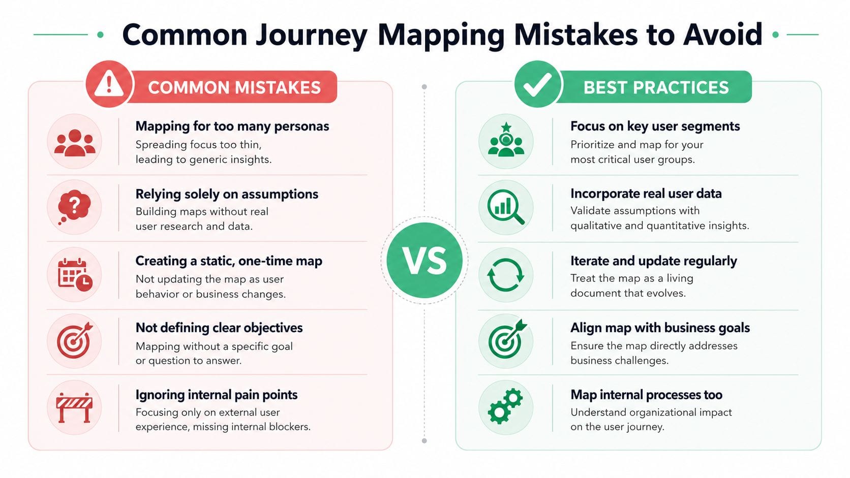
Most user journey mapping errors come from oversimplification. The map becomes too abstract to guide action or too decorative to survive contact with real systems.
Don't do this, do this instead
Don't rely on hypothetical personas.
Do use data-driven profiles. Common pitfalls include relying on hypothetical personas instead of data-driven profiles, which weakens the map from the start, as discussed in Adobe's overview of effective customer journey maps.
Don't draw a single clean path.
Do capture nonlinear, multichannel behavior. Users jump between devices, revisit pages, ask support, return from email, and pause the task entirely. A single straight line hides real friction.
Don't map only completed actions.
Do compare completed actions with desired actions. This reveals whether users are moving through the journey the way the business intended or creating workarounds.
Two more mistakes that quietly undermine the work
One is making the map too broad. If you mix acquisition, onboarding, support, renewal, and advocacy into one view, no team will know what to do next. Narrow the scope and make separate maps when the task changes.
The other is forgetting emotional evidence. If you label a stage as negative, there should be a reason behind it. Support logs, survey language, interview responses, repeated retries, and odd navigation loops all help justify the emotional line instead of turning it into guesswork.
The easiest failure to avoid
Teams build the map, present it once, and never update it. Then product changes, campaigns shift, events get renamed, and the map becomes a record of how the business worked months ago.
A good map should be visible, versioned, and reviewed. If it doesn't change as behavior changes, it stops being useful.
If your team wants user journey mapping that holds up under real analytics scrutiny, Trackingplan is built for that layer of the problem. It helps teams monitor analytics implementations across web, app, and server-side environments, catch broken events and schema mismatches early, and give analysts, marketers, developers, and QA a shared view of what data they can trust.